This feature will release on July 23rd 2026
Topics in this article:
- - What is it?
- - Who this article applies to
- - How to access it
- - Switching Themes
- - Editing the front page display (Theme Config)
- - Editing the front page layout (Menu, Blocks, etc)
- - What's next?
What is Swoop?
The Swoop Theme is a different format for your CG4 public site which brings a new professional look to your outward facing appearance that your audience are sure to enjoy.
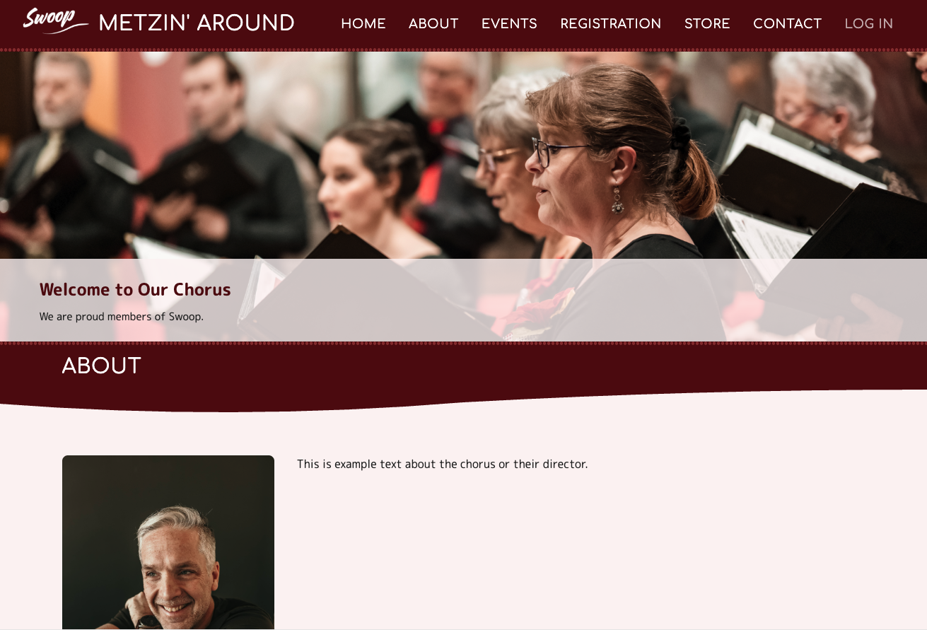
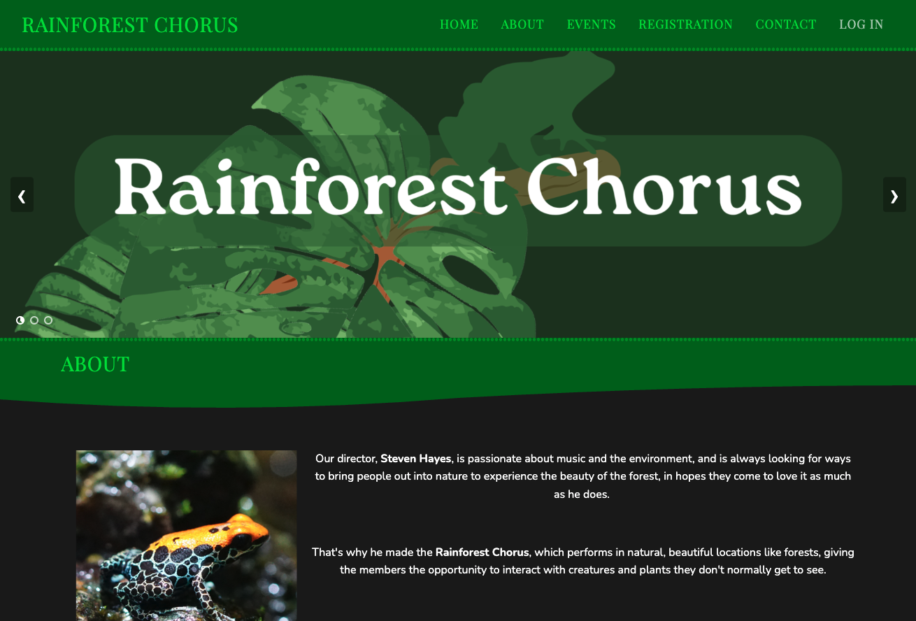
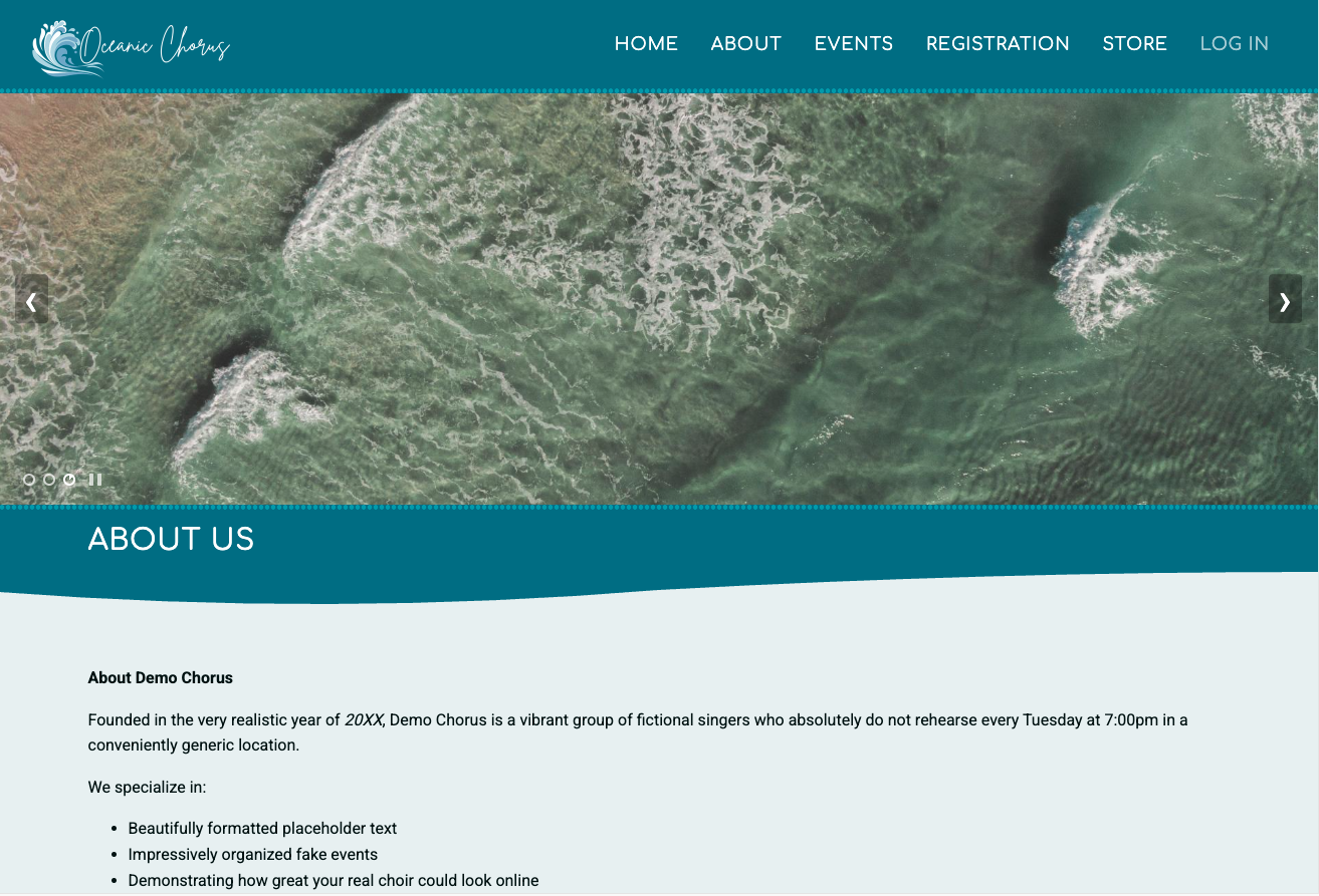
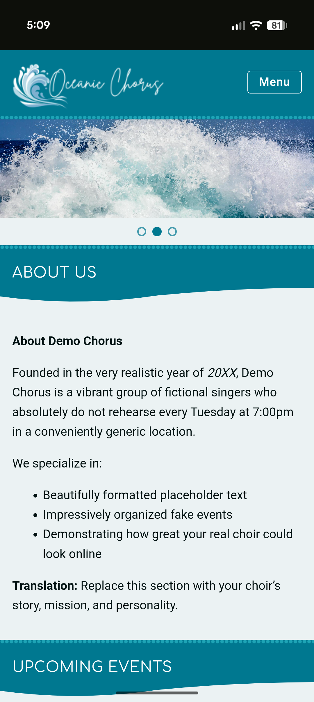
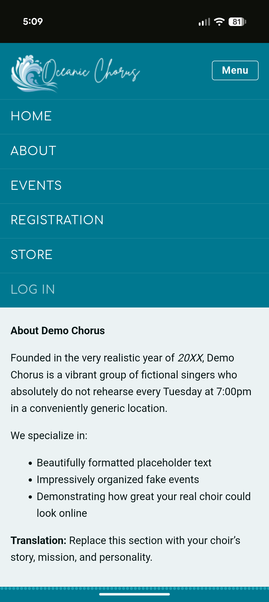
click an image to zoom in for a better view
Who this article applies to:
Only Admins have the ability to edit and change things about the Public Site.
How to access the Swoop Theme:
In the sidebar menu, you’ll see a section called Public Site. If you haven’t already, you can enable it by clicking on the Public site button, then Enable Public Site. You'll be taken to a menu that looks like this:
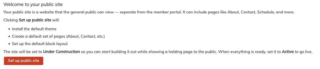
Click Set up public site, then select Under Construction, so only you and other admins can see the site while you're building it.
If you already have it enabled, head to the Basic Settings area of the Public Site settings, [Main Menu > Public Site > Basic Settings]. On that page you’ll see a dropdown menu called Public Site Theme. Click it and select Swoop, then save and wait for it to update.
Once it’s done loading the new theme, the Swoop theme will be active.
Note: Switching to a new theme for the first time can take a minute or two to load and refresh.
Switching Themes:
If you are switching over from G4Flat, keep in mind that the Swoop theme and G4Flat are saved separately. This means that you will not lose the edits and customizations you have made to G4Flat while you check out Swoop to see if you want to use it.
The Swoop theme will be full of demo data in the blocks on the front page (sometimes you will need to reset the blocks for the swoop theme to see this data) to help illustrate the look and feel of the theme.
If you do not wish to use the swoop theme, just switch the theme config back to G4Flat (under the Public Site Basic Settings menu item) and your original config will return.
Theme Configuration: Editing the front page display
Logo & Branding
In this section, you can add you own chorus logo and favicon, and choose how it displays at the top of your site.
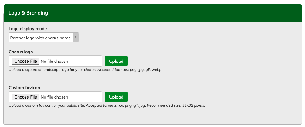
Logo display mode allows you to choose from the logo with your chorus name, just the chorus name, or just your logo. By default, the logo is "Swoop".
Upload your logo to the "Chorus Logo" field. The logo will be resized to 200 x 80 pixels (horizontal/landscape). Any image with similar ratio will work, but the site will also auto-crop it to fit.
A favicon displays in the tab in your browser. A simplified square logo works best. 32 x 32 pixels.
Need to change your site's name? You can do this under Public Site > Basic Settings
Remember to save your changes using the "save configuration" button at the bottom of the page.
Colours
The colours in Swoop allow more freedom in what you can change, so you can change different parts to whatever colour you want.
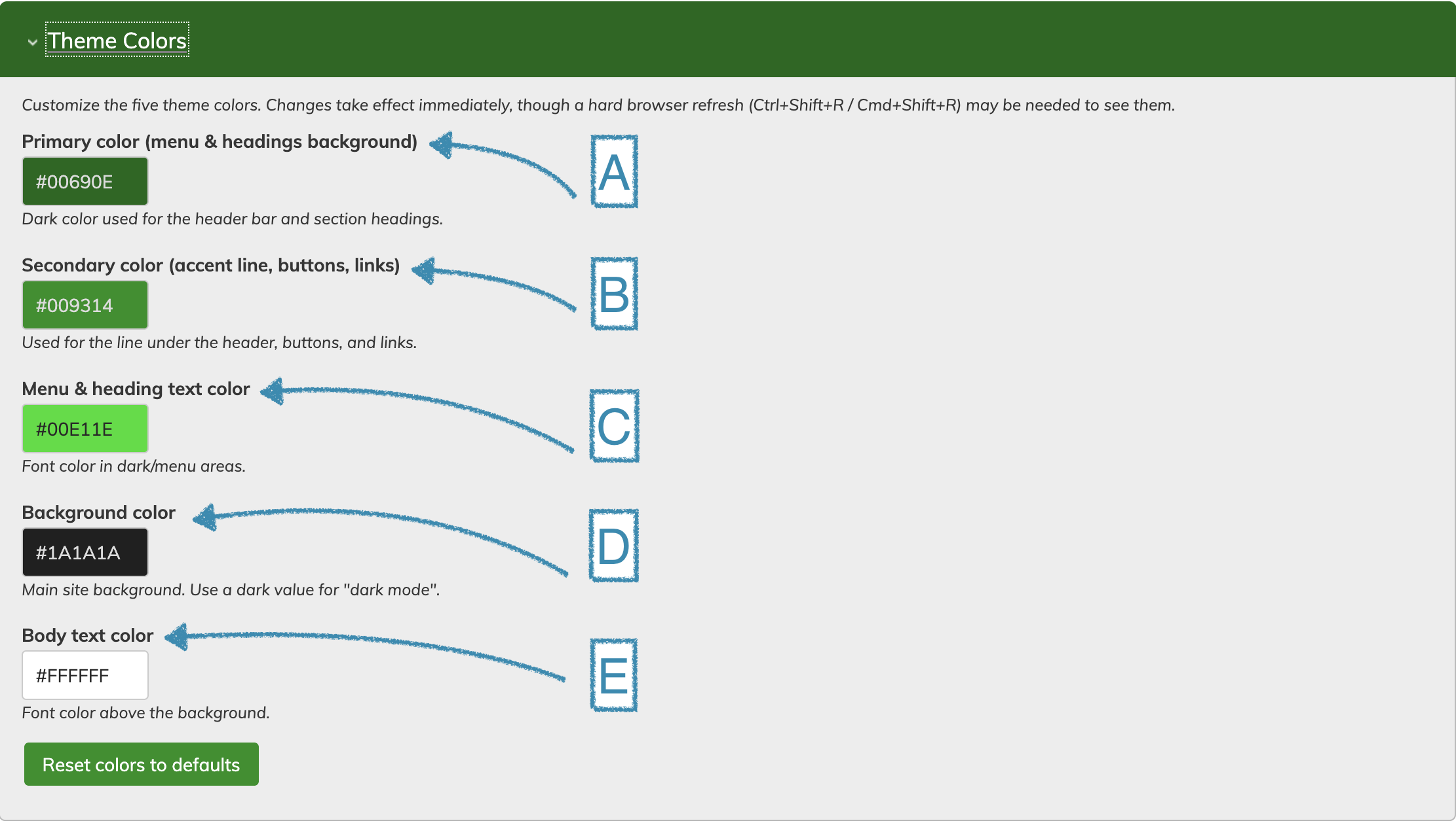
In Swoop, you have several colour options to edit to your liking:
-
A. Primary color (menu & headings background)
-
This is used for the header bar and section headings.
-
-
B. Secondary color (accent line, buttons, links)
-
This is used for the line under the header, buttons, and links.
-
-
C. Menu & heading text color
-
This is used for the font color in dark/menu areas.
-
-
D. Background color
-
This is used for the main site background. Use a dark value for "dark mode".
-
-
E. Body text color
-
This is used for the font color above the background.
-
Remember to save your changes using the "save configuration" button at the bottom of the page.
Banners
In Swoop, the banner can hold several images and will cycle through them slowly. When the cursor hovers over the banner, the cycling will pause on that slide until the cursor is moved off again.
Below the Theme Colours menu in the Theme Configuration menu, you’ll see a title called Rotating Banner. Click it, and it will expand to show the settings for the feature. You’ll see five slides, since it can support up to five images in the rotating carousel. Let’s start with the top one, the banner the user will see first when they enter the site. The settings options will be the same for all 5 banners/slides.
You’ll see three sections: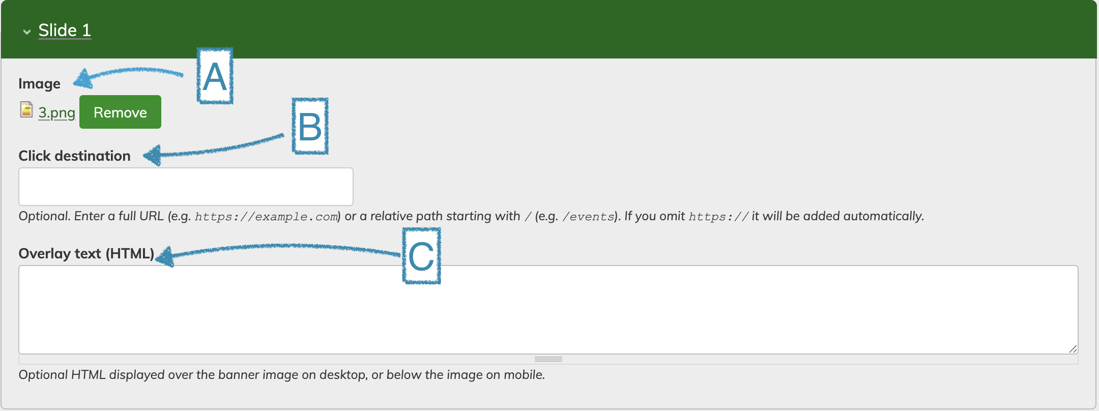
A. Image
This is where you put any image you want to display in the banner. The best shape and size is around 1920 pixels wide by 600 pixels tall. If you place an image of a different size in the banner area, it will be cropped to this size from the center (cutt
B. Click Destination
This is how you change where clicking on the banner will bring you. You can link to anything, but using a partial URL as you’ll see in the example in the menu will link to somewhere in the site.
To link to somewhere in the site, go to that page and copy the part of the link after ".com". It should look something like "/content/about" for instance.
C. Overlay Text
Use this to add a block of text that hovers over the banner. It displays along the bottom edge of your picture, over a semi-transparent background that matches your selected background colour.
Pro tip: Want text over the center of your banner image? Consider using a program like Canva to add text to your image.
Remember to save your changes using the "save configuration" button at the bottom of the page.
Typography
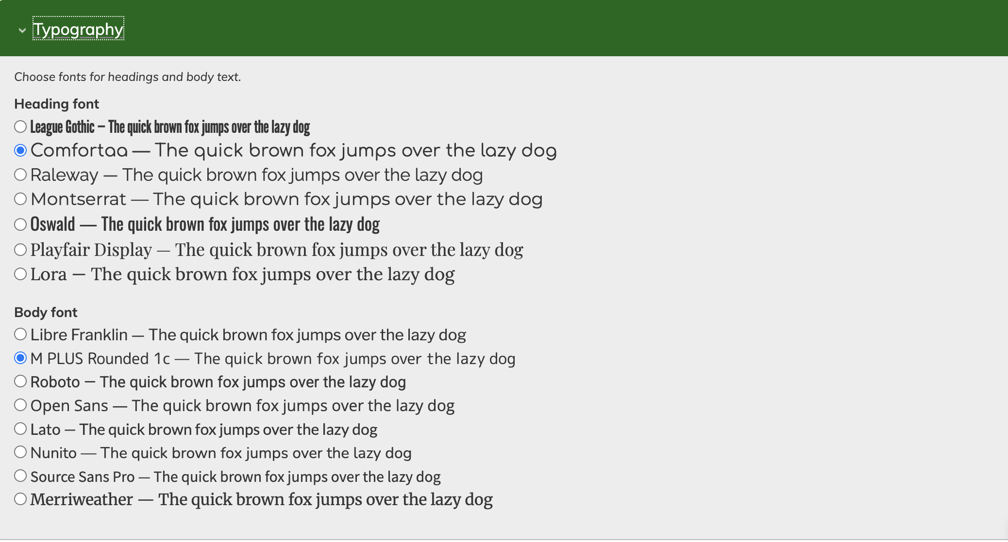
This area allows you to choose from a selection of fonts for the public site. There are options for both the Headings font, used in your site name, main public site menu, and page titles, and well as the Body font, used for page content text.
Remember to save your changes using the "save configuration" button at the bottom of the page.
Social Links
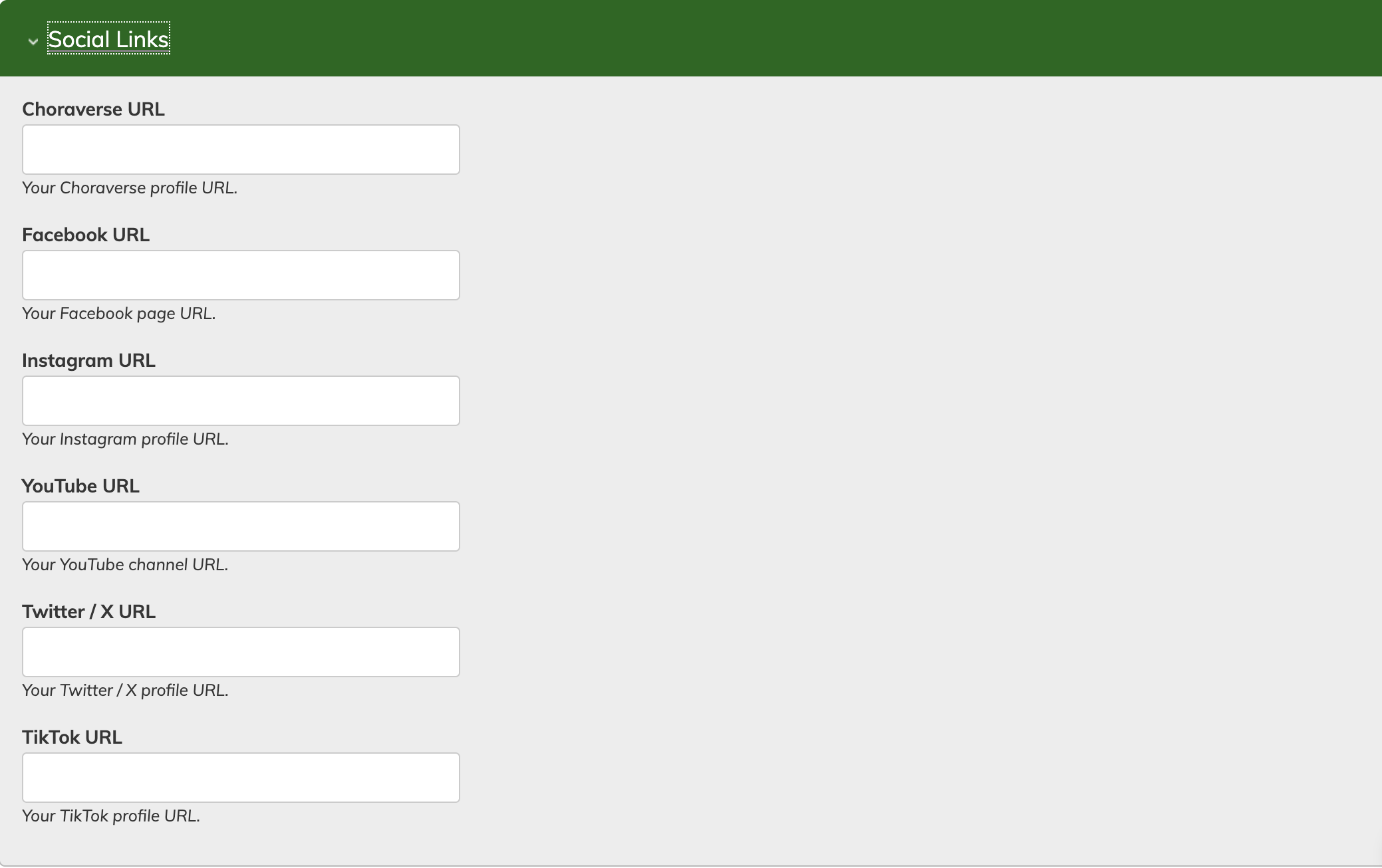
This is where you can add links to your presence on other platforms. They'll show up on your public site at the bottom as icons that bring you to the desired site. Enter the full url, including "https://"
Remember to save your changes using the "save configuration" button at the bottom of the page.
Editing the Front Page in Swoop: Menus, Blocks, Banners, etc.
In the Swoop theme, you can perform "front end" edits, meaning you do not always have to use the menu items to access edit areas.
Although you can still go to Public Site > Blocks and rearrange blocks and edit content (as you would in G4Flat) you can also edit area when directly reviewing the public site (only when logged in as an Admin).
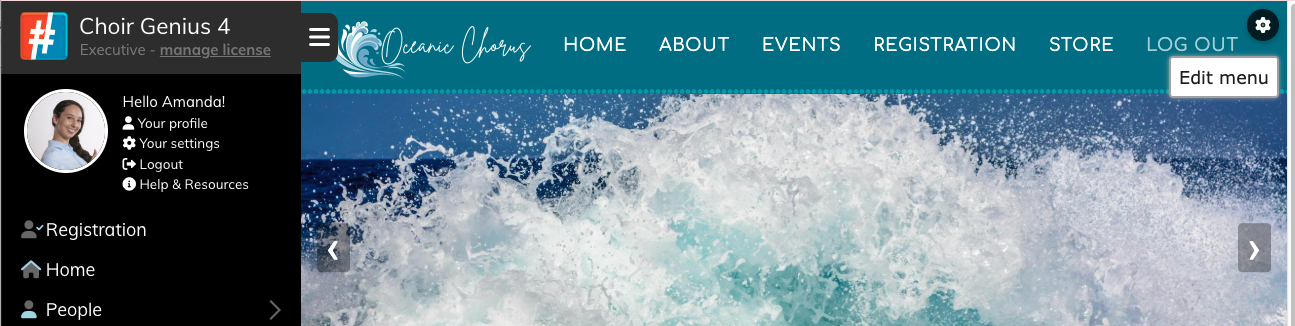
menu edit (above)
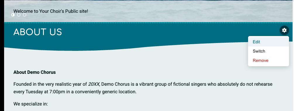
block edit, switch, or remove options (above)
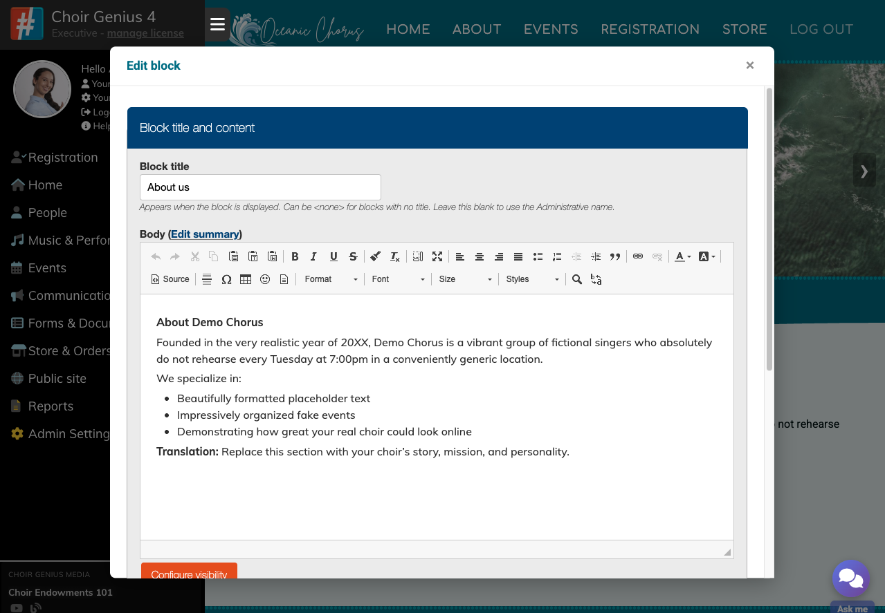
Front end block edit view (above)
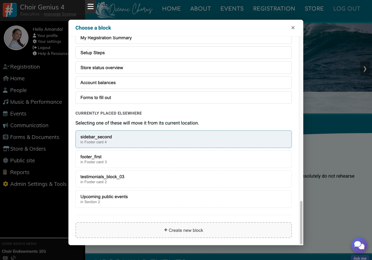
Front end block switch view (above).
This will remove this current block and switch it out with another. If you use a block that is currently used elsewhere, it will remove it from that current placement, and place it where this block is. You can also make a new block and immediately use it to replace the current one.
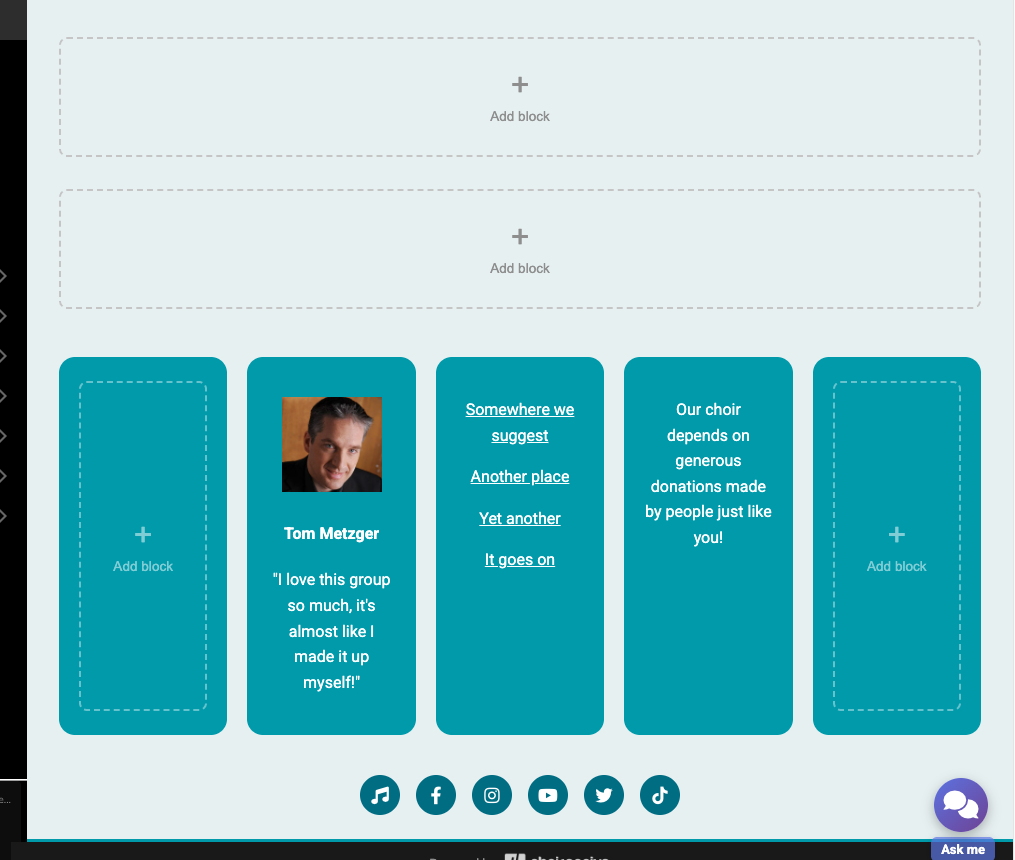
Add blocks to currently unoccupied regions (pictured above).
What's next?
Now you've set up your public site theme, you can get started setting up the pages themselves. Read more about setting up your public site
on this help page!
Once you're done getting everything the way you want it, go back to Basic Settings and click Active. That will make your public site visible to anyone who visits, so make sure you're ready to publish.
